
BRAWLOSSEUM
Brawlosseum is an arcade game about cooperation and communication. Created as my capstone project at OCADU, the game is inspired by the increasingly complex mechanics of AAA games experiences, and my own belief that user interface and experience are game design. The project combines elements of game design, UI/UX design, industrial design and branding. My objective was to encourage other players and designers to think about their interface design the same way they think about traditional gameplay and mechanics, and develop other exciting new interface experiences.


Objectives
Exhibit Experience: As my final capstone project at OCADU, I knew from the start that the game would be shown at the 102nd Graduate Exhibit on the college campus, alongside hundreds of other projects. Previous game projects have been exhibited using a keyboard or controller connected to a laptop or PC, but they often appear lackluster, despite interactive exhibits often drawing the largest audiences.
The Audience: This event is attended by people from all over Toronto, coming to see the work of young artists and graphic designers, but traditionally not game designers. This meant my project should be accessible to players of all levels.
Interface as Gameplay: The key inspiration for the is assignment was the idea of interface design and user experience as core parts of the player experience. Gameplay stories are often “I slayed the dragon with my magic sword” and not “I navigated the menu to equip the magic sword and fire-resistant armour”, but setup and understanding of deeper mechanics are key elements of the play experience. These are often executed with interface.
Personal Showcase: As a self-directed project, I wanted this to be a unique experience which I could always point as a highlight of my portfolio, that couldn’t be found anywhere else. Something that would stand out and I could be associated with.
Mechanics
Two players control the two different elements of a traditionally single player game experience. Player 1 controls the character, moving within a small room and fighting enemies which spawn at the edges of the space. Player 2 controls the character’s inventory and equipment; a selection of 9 weapons in total for 3 types and 3 colours, corresponding to 3 types and colours of enemies.
Players are only able to damage enemies by matching either type, or colour an enemy. This means players need to communicate which enemies are a threat, and pick the correct weapons. Matching just colour is an simple to understand mechanic, which knowing which weapon type allowed more keen players to be more effective. In addition, weapons would deteriorate with use, and new ones would need to be picked up, giving players challenge of not always having the exact tool for the job.
Early prototypes and wireframes for the game also featured other mechanics, such as spells and items for Player 2 to use, but did not make it to the final game. Along with just been one extra thing to learn and implement, simplifying the game for a non-game audience allowed the experience to be easier to understand.
Tutorialization
To ease new players into the mechanics, the beginning of each new session was fixed, before enemy spawns become randomized. This gives players a quick introduction to the game using simple text and highlights, and lets them slowly become familiar with UI elements as more are introduced.
UI Elements
The UI was designed to be simple, but also had several overlapping states to display. Weapons would start as invisible, and appear as they are picked up by players 1. Weapons also required a “energy” indicator, and if a weapon is used too much, it is no longer usable until picked again. It was also necessary to communicate which weapon the player has equipped to both players, without having to look at the other’s side of the screen.
The UI portion is the right third of the screen, and uses a layout inspired by the presentation of apps on a modern smartphone, bus styled to match the stone background of the rest of the game. A combination a semi-diegetic and meta elements are used to communicate information to the player.

The project also required a custom monospaced typeface to match the pixel aspect-ratio of my screen exactly. This typeface was key in creating a high score screen where players could input their own initials.

Art Assets
I made the decision early on to go with a roman-fantasy style theme for the game’s art assets. Using the look of a colosseum was a pretty simple way to communicate the player objective (survive!), and gave some good existing creatures as enemy inspiration. This also served as the inspiration to stylize the UI tiles for player 2 as stone tablets. The use of pixel art also was a simple decision, to make the game read as a historical arcade machine.
A logo was created for the game’s title screen, along with a matching backlit marquee to be mounted atop the cabinet. Using the 3 key colours in-game, and applied to type treatment inspired by vintage fantasy novel covers.

The Cabinet
To really create an attractive and memorable presentation for the game, I decided to go all-out and build a full-size arcade machine. As someone with little experience in woodworking and electronics, this was going to be a challenge. I discovered modern ways to overcome both these challenges.
To build the cabinet, I studied flat-pack furniture designed with a CNC mill, allowing them to be built without fastening hardware such as nails. This would also allow me to prototype the design virtually, and then have CNC machine produce the pieces which I already knew would fit together, eliminating time spent in a shop. The schematics for the cabinet are available under a Creative Commons Licence, at the bottom of the page.


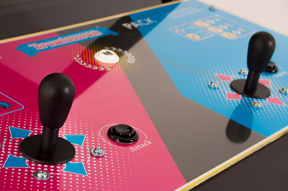
As for the controls, research into fight sticks and arcade emulation turned up several DIY kits to choose from which could connect via USB and output simple keyboard commands, eliminating the need to custom control software to communicate with Unity. The one I ended up using is available from X-Arcade.
I also created a graphic to place the controls on, which matches the branding on the marquee and in-game. This graphic also featured tutorials for the basic concepts of the game in text and graphic format.


Promotion
Once the cabinet had been finished, I invited some friends to come play the game, and take some promotional shots in a matching retro style. Dressing like it was 1988 was suggested.


These photos were then applied to a series of flyers and posters put up around the exhibition to promote the game. The final version of these were printed, creased, then scanned and printed again, to add those crease marks to as part of the design, and give the image of a poster sitting in an arcade window for one summer too many, before being taken down and folded away.

Cabinet Schematics
I’m releasing these under a Creative Commons (CC BY-NC-SA 4.0) Licence. You’re free to use, edit and remix them for non-commercial purposes, provided you give credit. If you have any questions, or are interested in commercial use, send me an email chat@colinbrannan.ca. Even if it's not commercial, email me. I'd love to see what you're working on.
Included
- Vector files for use with a CNC machine (cabinet frame, the control housing, an acrylic matte for the monitor)
- Fusion 360 Files, to make edits to the design
Notes
- The final machine measures 33in/84cm wide, 28in/71cm deep and 67in/170cm tall. That is probably bigger than you are imagining. It was for me.
- The folder contains versions of the files at for ply at 0.5 and 0.47in thick. I originally designed for 0.5, but measure the actual material I had was closer to 0.47. It's worth doing the same and adjusting the constant in the dwg file to your size.
- On my project, I used baltic birch plywood, for it’s combination of lightness and strength. However, it did experience some warping after being cut. This slight warping meant assembly was a heavy job, involving a rubber mallet, wood glue and standing on the box to hold it in place. Doable, but 2 people worked up a sweat.
- I worked with the staff at my CNC shop to add small tabs to keep the shapes attached to the board during cutting, which then had to be sawed free and sanded off. Ask your CNC shop if they can/should do the same.
- If you plan to use these, it’s a good idea to be familiar with the whole process. This video was immensely helpful for me https://www.youtube.com/watch?v=VZU_Jpyyc5M
Dropbox folder

This work is licensed under a Creative Commons Attribution-NonCommercial-ShareAlike 4.0 International License.